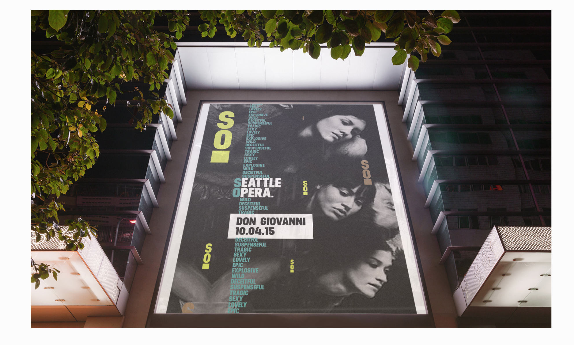
Seattle Opera
Life. Loud. Brand refresh
A total refresh of the brand to make the Seattle Opera amplified and as operatic as the opera is itself. It was a fascinating journey to discover the beautiful problem. To make Seattle Opera a plausible entertainment option for a broader audience we needed to move far away from the brand and imagery that they displayed that simply reinforced the image of an old an boring opera. We just needed to make sure we could present this world famous opera in a truthful, yet provocative way that showcased it’s strengths. To do so we teased storylines and used a basic, bold type face in a way that did exactly what the opera does. The natural amplification of the human voice. One cool discovery was when Clara, the design director realized that SO the initials of Seattle Opera also happened to be a word we use in American English to colloquially amplify our statements in conversations.


